Tahoe Surf Co.
Rejuvenating an existing brand into a relevant lifestyle brand that can scale.
The Client
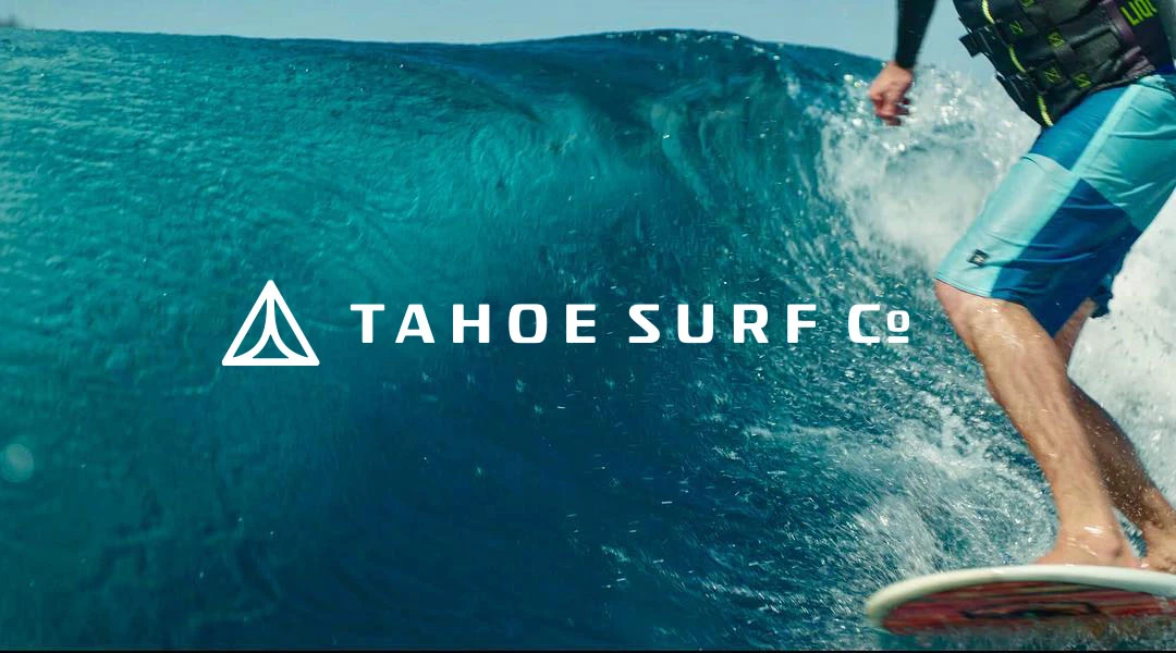
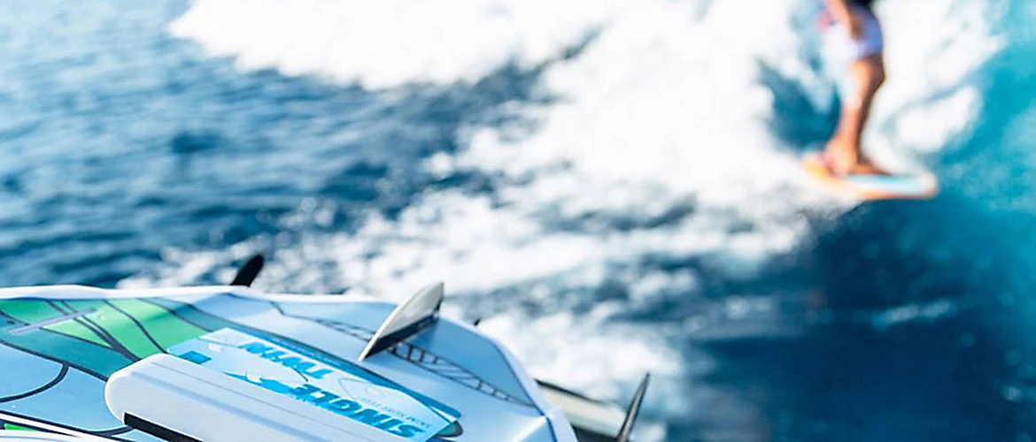
Tahoe Surf Co. provides wake surfing experiences on Lake Tahoe, with rental equipment for its on-water services. The business is about getting people out on the lake, not selling boards or gear.
The Challenge
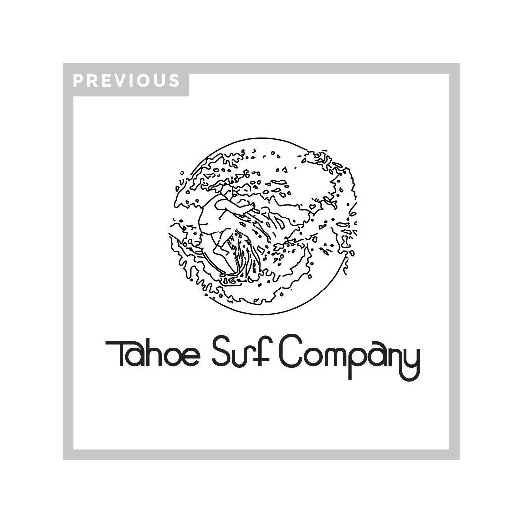
After several years of doing business, the existing brand needed to evolve to refine its market position in tandem with its brand identity and strategy.
The Strategy
The strategy brought the credibility of board-sport culture to an experience that still needed to feel approachable. The identity had to speak to experienced wake surfers without intimidating someone trying it for the first time.
The Design
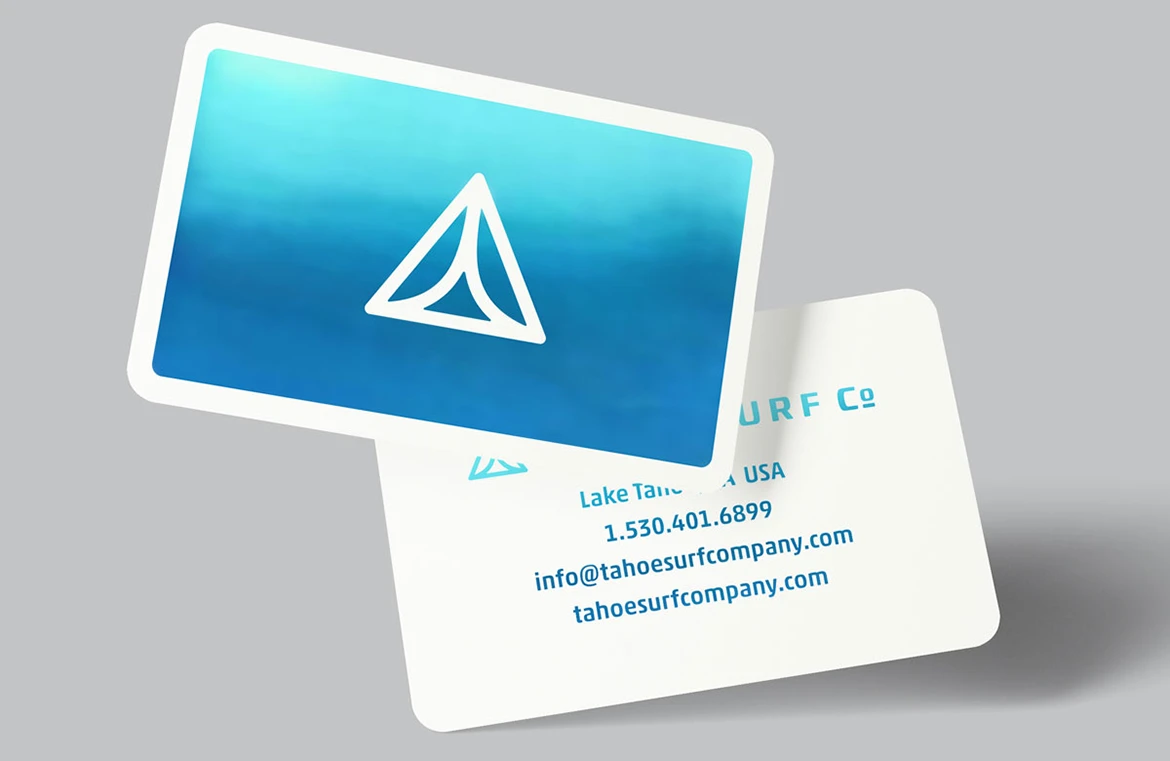
The brand’s identity from logo to web and merchandise needed to be refreshing, fun, and have plenty of energy. The design needed directional angles accompanied by a fresh color palette and a scalable icon. These elements would help accomplish the brand strategy and build towards the business objectives.
The Creative Solution
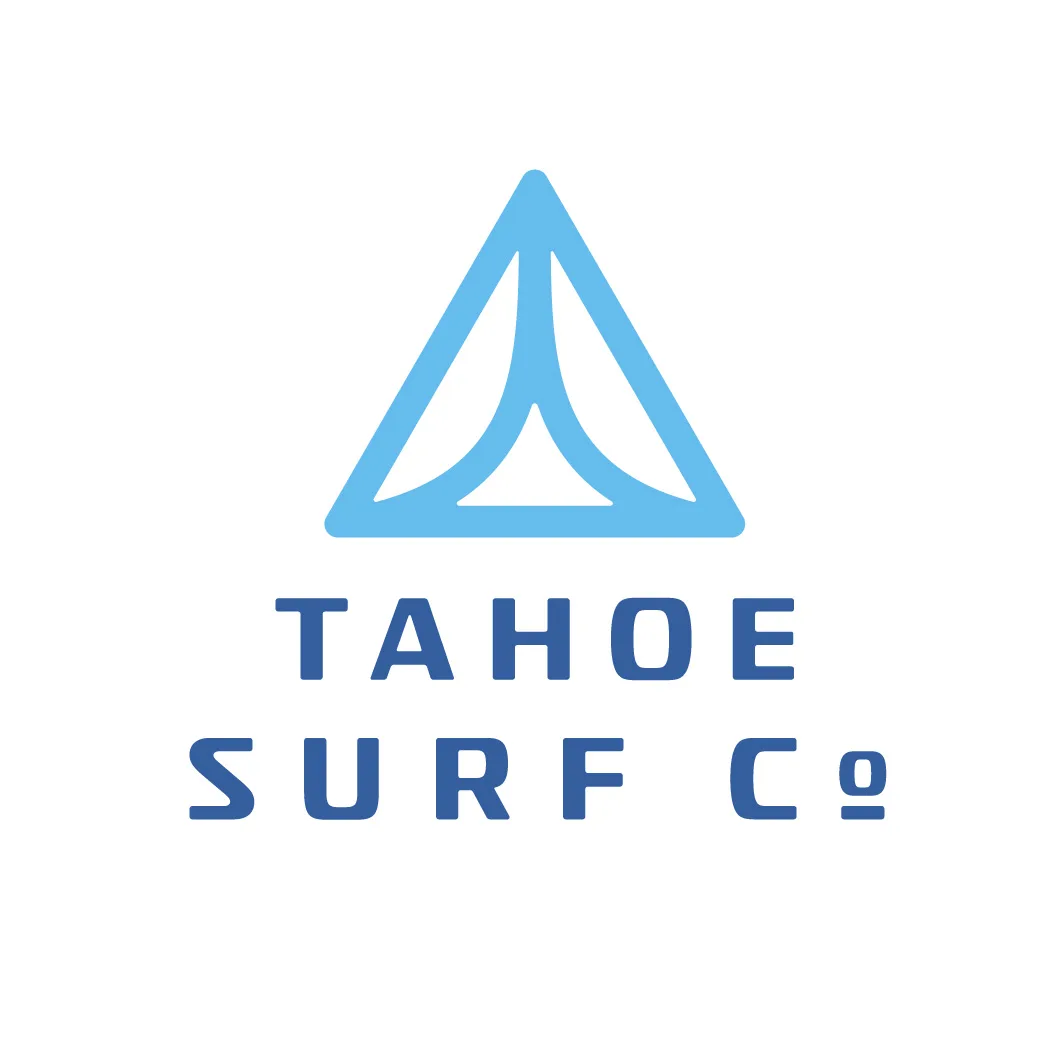
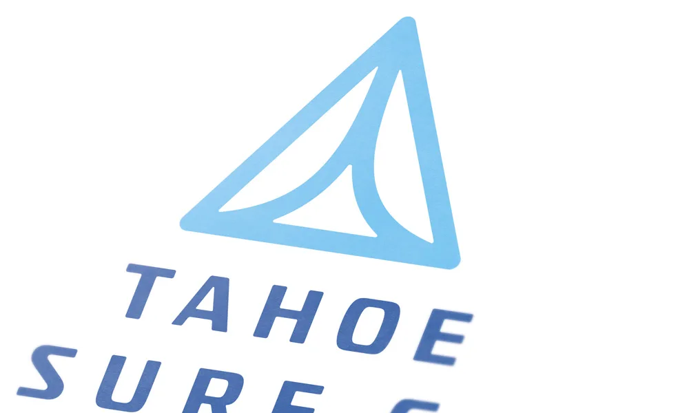
Appealing to both the high-end professionals and those who are just beginning through a brand that relates by connecting the identity concept to the activity as well as the lifestyle Tahoe Surf Company represents. The logo is agile yet still human and welcoming. The mark represents an aerial view of the wake the boat makes, while also being a minimal icon that is scalable and memorable.
The Results
The Shift
Tahoe Surf Co. gained a more cohesive identity that connects to board-sport culture while still feeling specific to the lake. The identity gives the wake surfing service a distinct presence while keeping the invitation to get out on the water approachable.
Explore the thinking behind our work.
What Improved
The brand felt current again.
The identity refreshed the business without losing the energy of Tahoe surf culture, giving the brand a more current look while preserving the laid-back, lake-driven attitude customers already associated with it.
Pros and beginners could both belong.
The system balanced credible board-sport cues with a more welcoming, accessible feel.
More profit and financial freedom.
The rebrand and pricing strategy helped increase pricing power, create enough demand for the business to become fully booked, and give the owner greater financial freedom.
The mark could work anywhere.
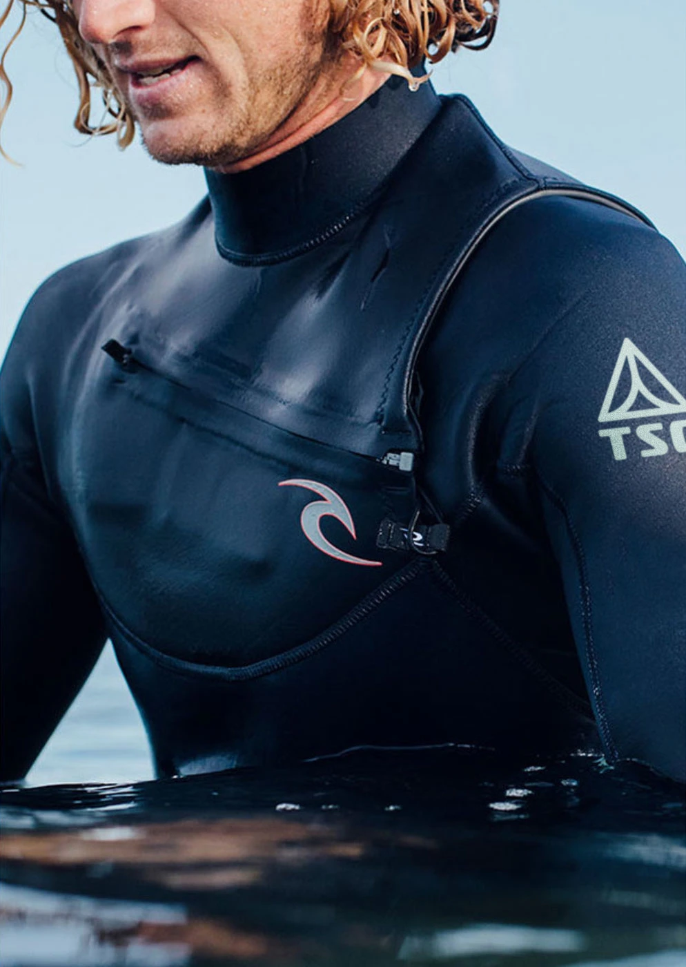
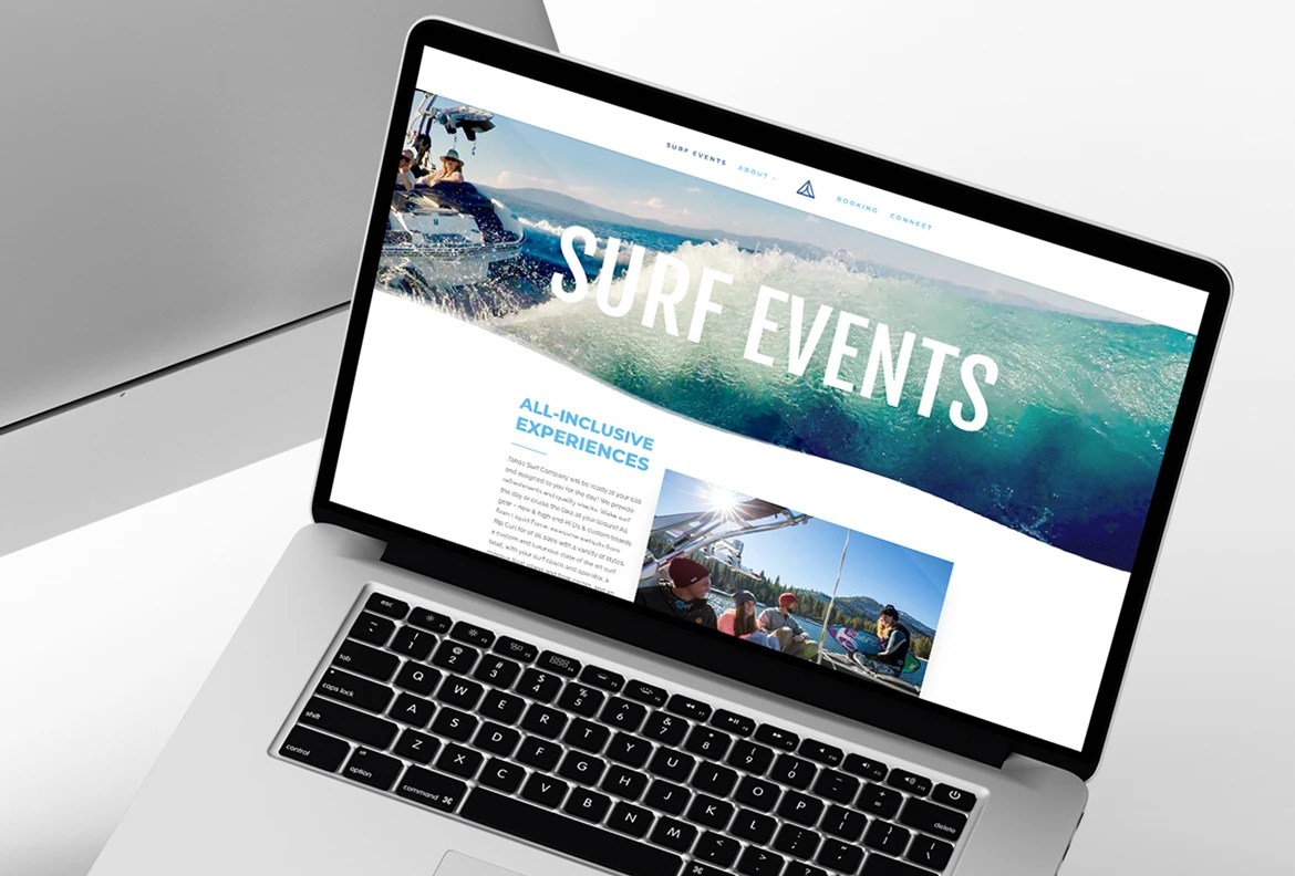
The simpler icon gave the business a more usable system for its website, branded merchandise, and rental equipment used during wake surfing experiences.
– Jeb Scicluna (Founder, Tahoe Surf Co.)