Thirsty Sunshine
Bringing the sun to a one of a kind skin and suncare line through a nostalgic California brand.
The Client
A very unique patented product that is disrupting the sunscreen and beauty industries.
The Challenge
Introducing a new brand to an established market where it must not only stand out, but educate while being relevant.

The Strategy
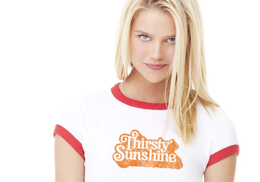
The brand strategy created to introduce this one of a kind product was to develop a familiarity with the consumer through the use of nostalgia. By having an aesthetic that is rooted in the 70’s era while still having an essence of relevant youthfulness, we positioned the brand to be approachable yet still have a high-end cosmetic quality.
The Design
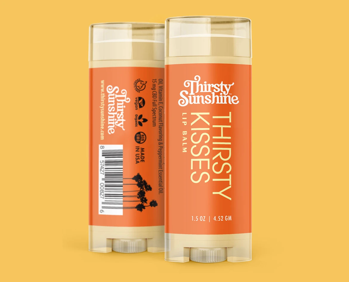
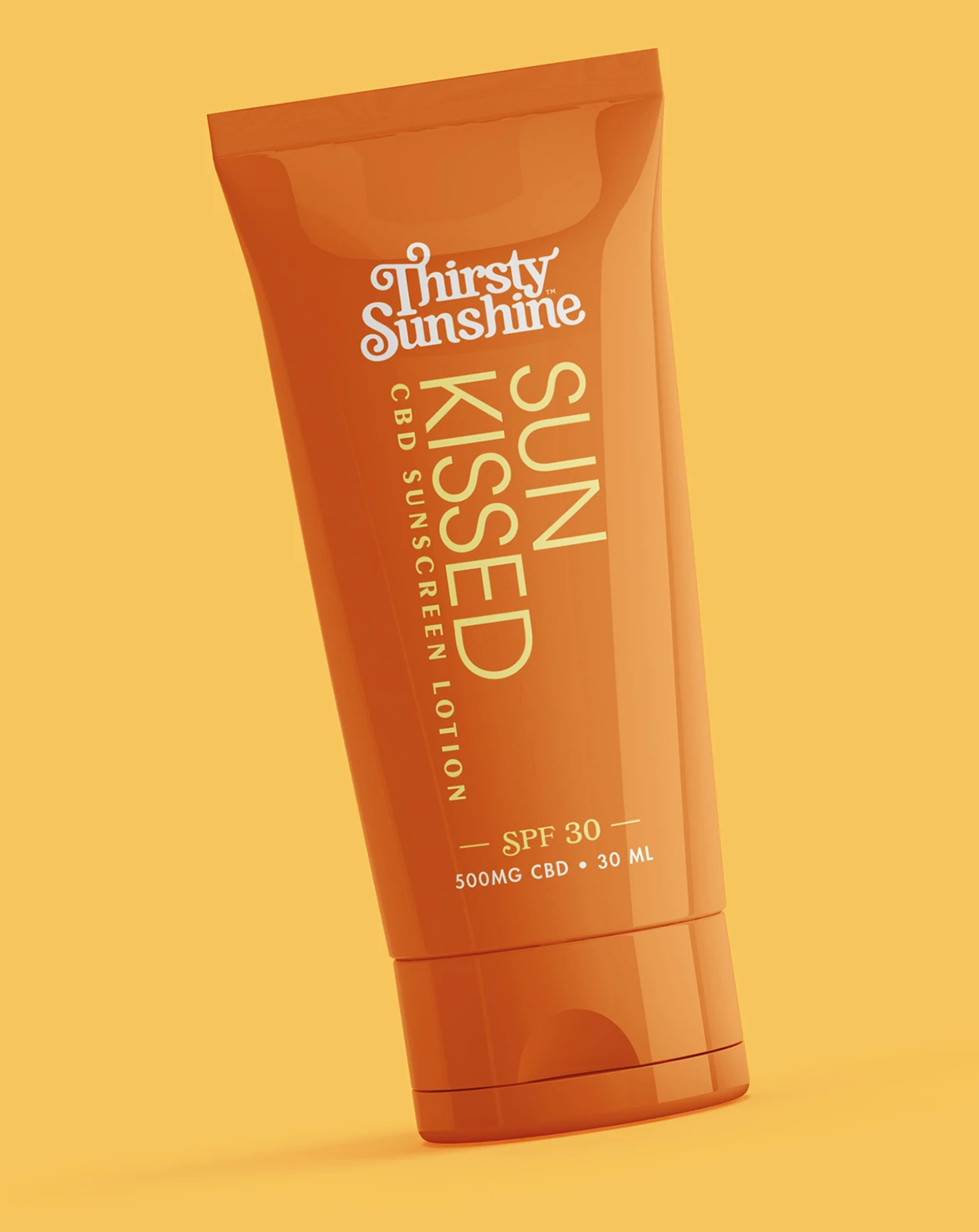
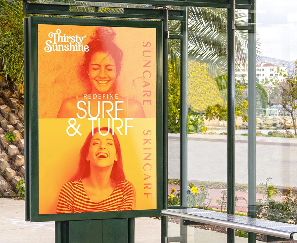
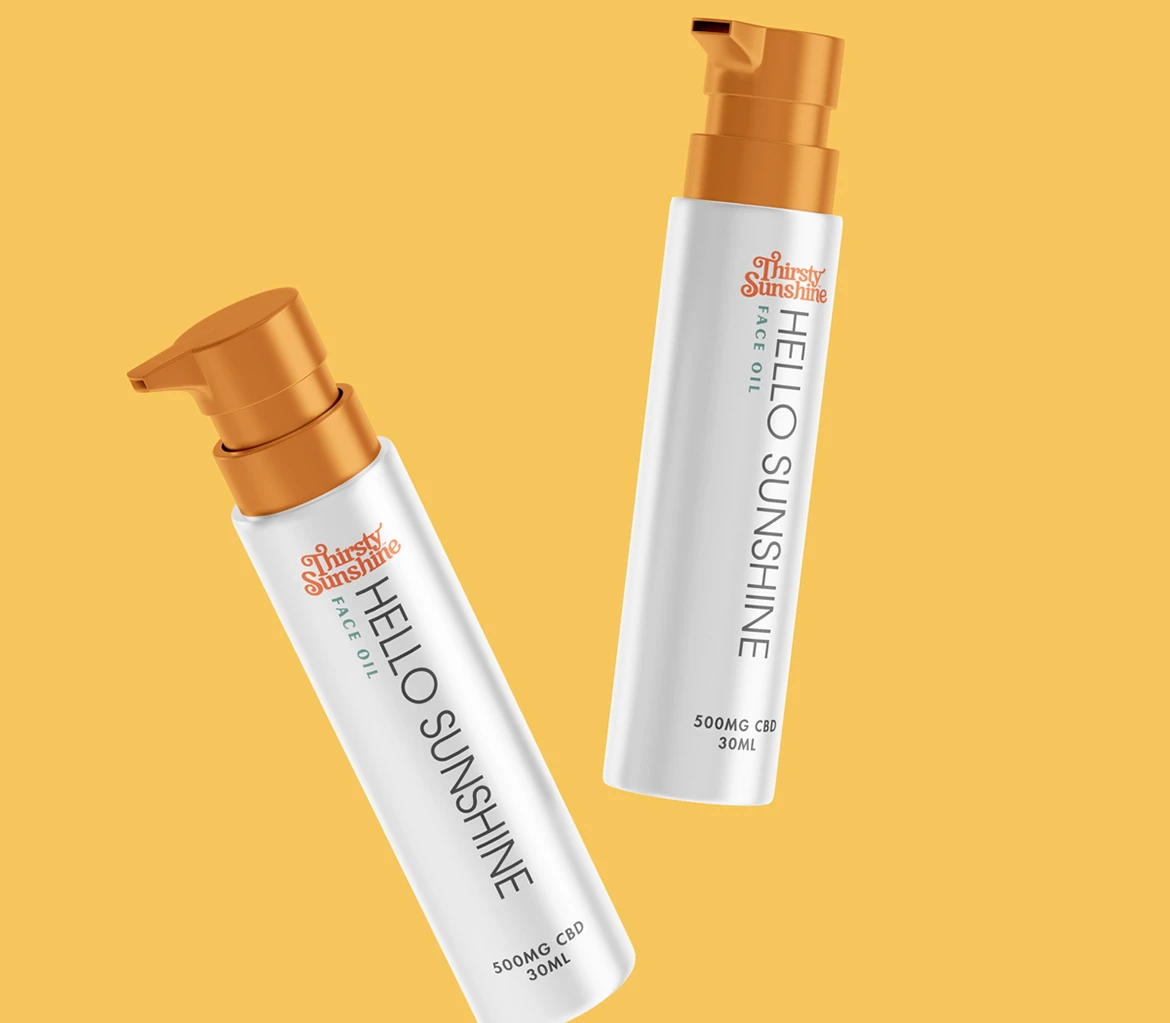
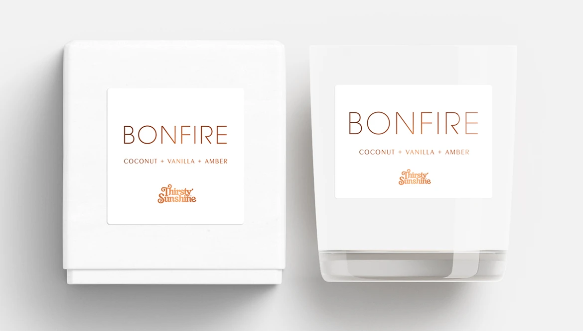
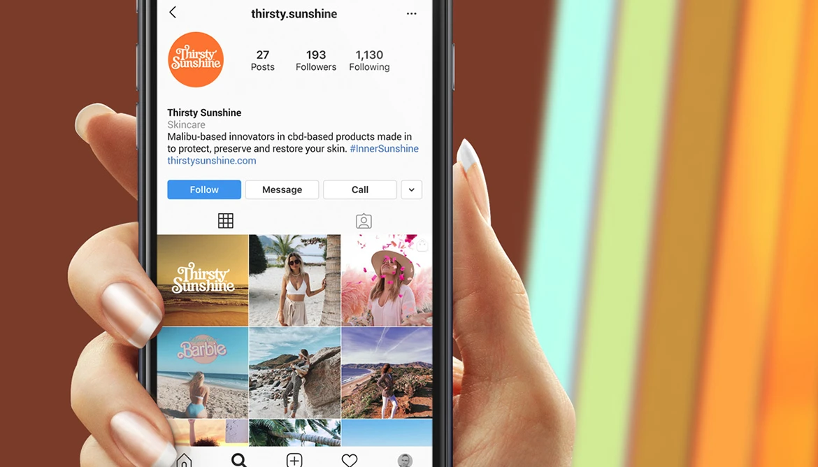
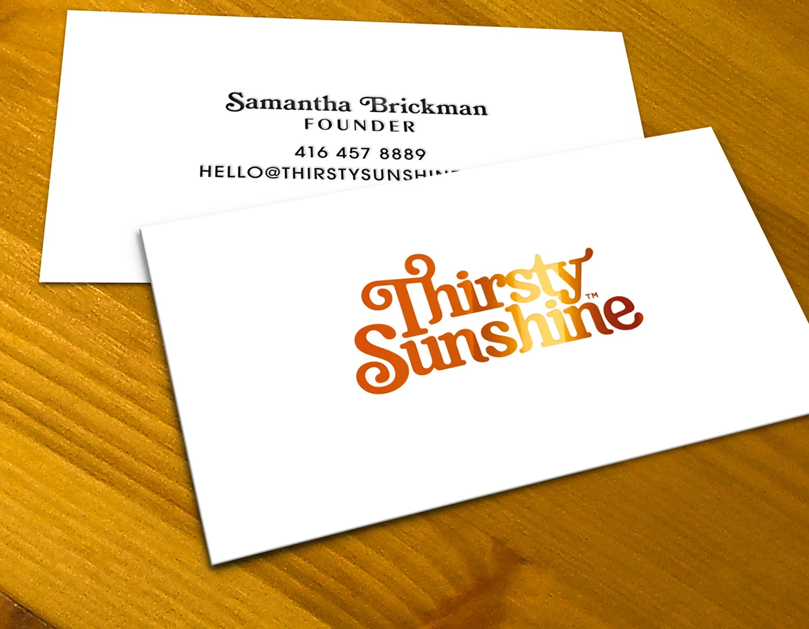
The brand’s identity from logo to packaging is an upbeat, happy vibe inspired by the 70’s. The design on all fronts is balancing a clean and minimalistic aesthetic that with the funky design of the timeless 70’s, by doing so the design is always in a state of juxtaposition and creates intrigue for the viewer.
The Creative Solution*
The balance of familiarity helps the brand be viewed as an already accepted option increasing the market adoption of this new product and brand.
The Results
Thirsty Sunshine became easier to understand as a patented beverage idea with a nostalgic California point of view. The brand made the product feel familiar enough to approach and distinctive enough to remember.
The Shift
The brand used sunny California nostalgia to make a patented skin and suncare product feel familiar enough to try and distinct enough to remember.
Explore the thinking behind our work.
What Improved
The new product felt familiar.
The strategy used California nostalgia to introduce a patented product into an established category.
The brand made disruption easier to approach.
Familiar visual cues helped explain something new without making it feel clinical.
The identity brought sunny energy.
The upbeat system gave the product a memorable presence in skin and suncare.
The look stayed clean and fun.
The brand combined minimal structure with retro warmth so it could feel credible and emotionally appealing.
– Samantha B., Founder