Rolld Ice Cream
A creative twist on the timeless treat everyone loves.
The Client
This unique ice cream parlour in Downtown San Luis Obispo starts with a pure liquid and transforms it into your frozen dessert of delicious, rolled layers right before your eyes.
The Challenge
As a distinct business model entering a growing market, it was only befitting that an eye-catching brand be developed that conveyed their unique process and appeal with diverse brand implementation. This would allow for successful market entry as well as long term success due to recognizability.

The Strategy
The brand needed a clear direction that was both relevant and appealing to the younger families and college students without being trendy. The strategy was focused on creating a brand that was deliberately bright, happy, and relatable while still maintaining a professional and trustworthy essence to ensure quality and consistency.
The Design
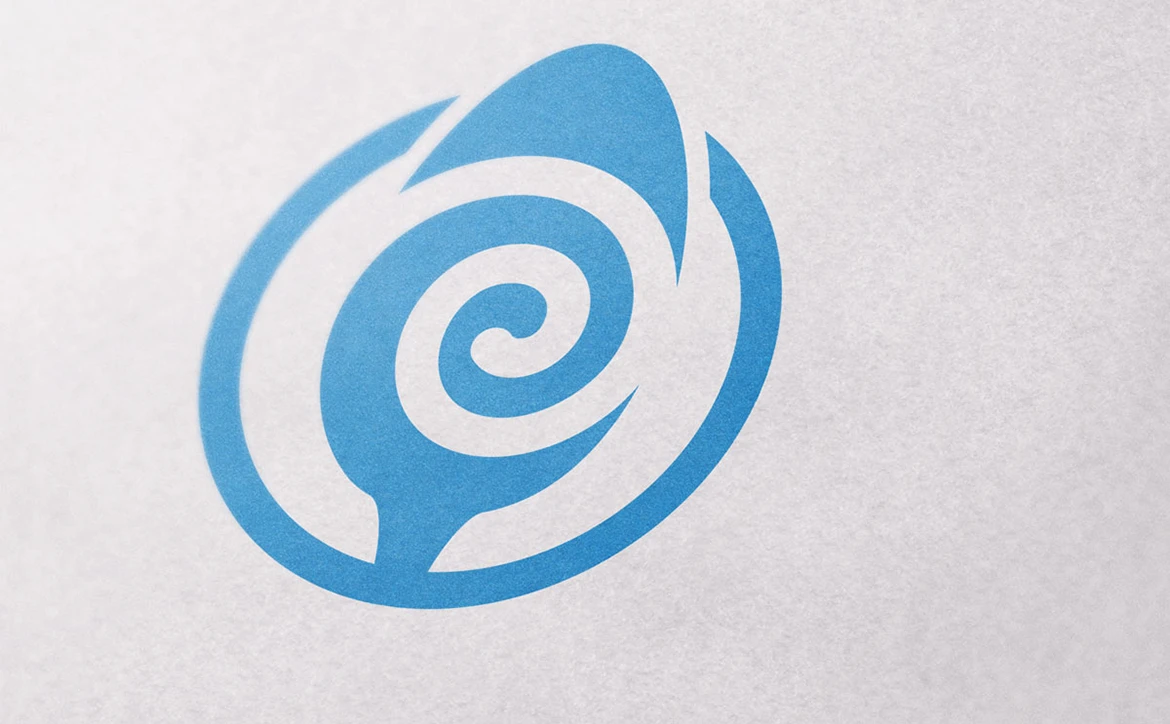
The strategic direction for the brand was portrayed by several elements throughout the brand’s identity. The electric blue color to draw attention and appeal to the younger audiences while setting itself apart from the common colors used in the ice cream market like red. The design is based on the rolled layers of the product resting on a spoon which suggests action to eat and enjoy. The friendly lettering has a swoop leading from the “R” that hints at the elements of a smile while the “R” also has a droplet within which gives a nod to the original state of the product and the start of the experience when ordering.
The Creative Solution*
The signals that are embedded throughout the brand’s identity are key to reinforcing the strategy as well as the overall brand experience. Since the business model is very unique and rooted in the experience of seeing your rolled ice cream being created before your eyes, this was paramount for developing a successful creative solution.
The Results
Rolld gained a brighter, more direct identity that made the ice cream process part of the appeal. The brand helped customers quickly understand the experience, remember the product, and associate the shop with something fun to share.
The Shift
The identity made the making process the hook, turning rolled ice cream from a dessert purchase into a quick, shareable experience.
Explore the thinking behind our work.
What Improved
The product transformation became the story.
The brand made the rolled ice cream process more visible, memorable, and fun.
The identity caught attention.
Electric color and bold cues helped the shop stand out with families, students, and foot traffic.
The brand felt playful without becoming trendy.
The system balanced youthful appeal with enough simplicity to last.
The identity supported the treat itself.
The visual system made ordering feel like part of the entertainment, not just a transaction.