Family Service Agency
Replacing the stigma of social services with a clearer path forward.
The Client
Family Service Agency (FSA) is a 125-year-old nonprofit human-services organization serving people and families through support programs that help them navigate difficult moments, restore stability, and move toward healthier futures.
The Challenge
For over a century, FSA carried deep institutional trust, but the brand needed to make its relevance easier to feel in the present. The organization had evolved through growth, service expansion, and integration, yet the public story still risked being read through symptoms, labels, and stigma. After several acquisitions, the brand had started to look and feel fragmented for those inside the organization and those encountering it from the outside. The challenge was to create a brand that honored the organization's history while making help feel more approachable, human, and actionable.
The Strategy
We reframed the brand around the situations people are actually facing and the futures they are trying to move toward. Instead of organizing the brand only around services, programs, or clinical labels, the strategy made the path to support relatable and easier to understand.
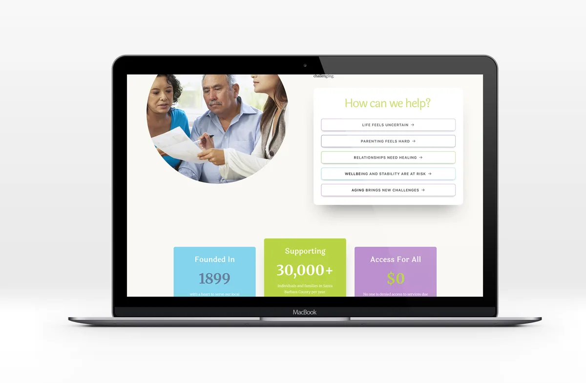
The rebrand clarified how FSA could reduce the shame of asking for help by naming the human moment first: what someone is experiencing, what they need next, and how the organization helps them take that step.
The Design
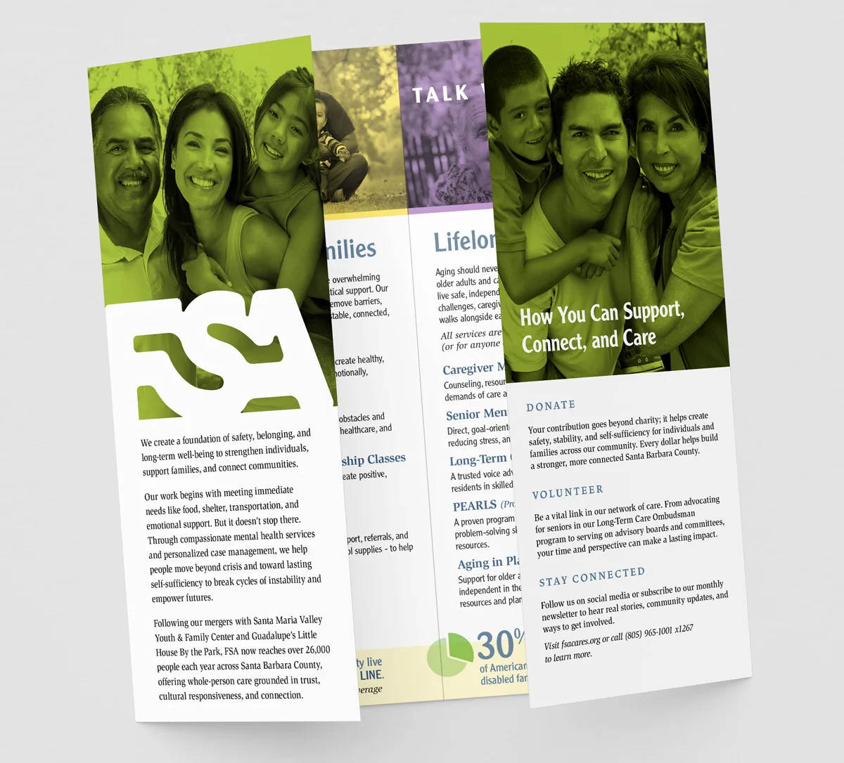
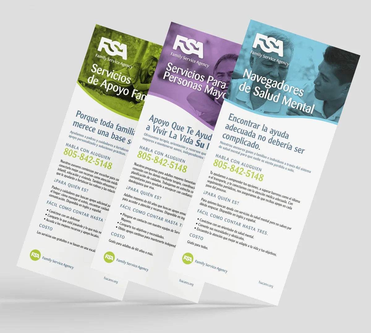
The identity system needed to feel established without feeling institutional. It had to carry the authority of a long-standing organization while making the brand warmer, more current, and easier to navigate for people in vulnerable moments. The design needed to leverage existing visual elements while still transforming the brand.
The Creative Solution
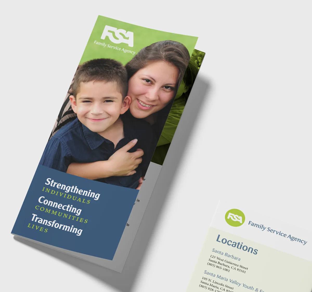
The new brand system gave FSA a clearer way to organize meaning around pathways. Each pathway helps people see themselves in the brand without being reduced to a problem, label, or diagnosis. The identity is new, but familiar, because it leverages color and nuance from the past brand.
The result is a social services brand that feels less like a list of programs and more like a trusted guide through a real-life transition and challenges we all face.
The Results
FSA now has a brand platform that can carry more than a century of trust into a more modern, accessible, and transformational expression.
The brand makes the organization's work easier to understand by connecting services to the experiences, situations, and desired next steps people are actually living through.
After several successful acquisitions, the rebrand also set FSA up with a more coherent platform for future mergers, acquisitions, and service integrations.
The Shift
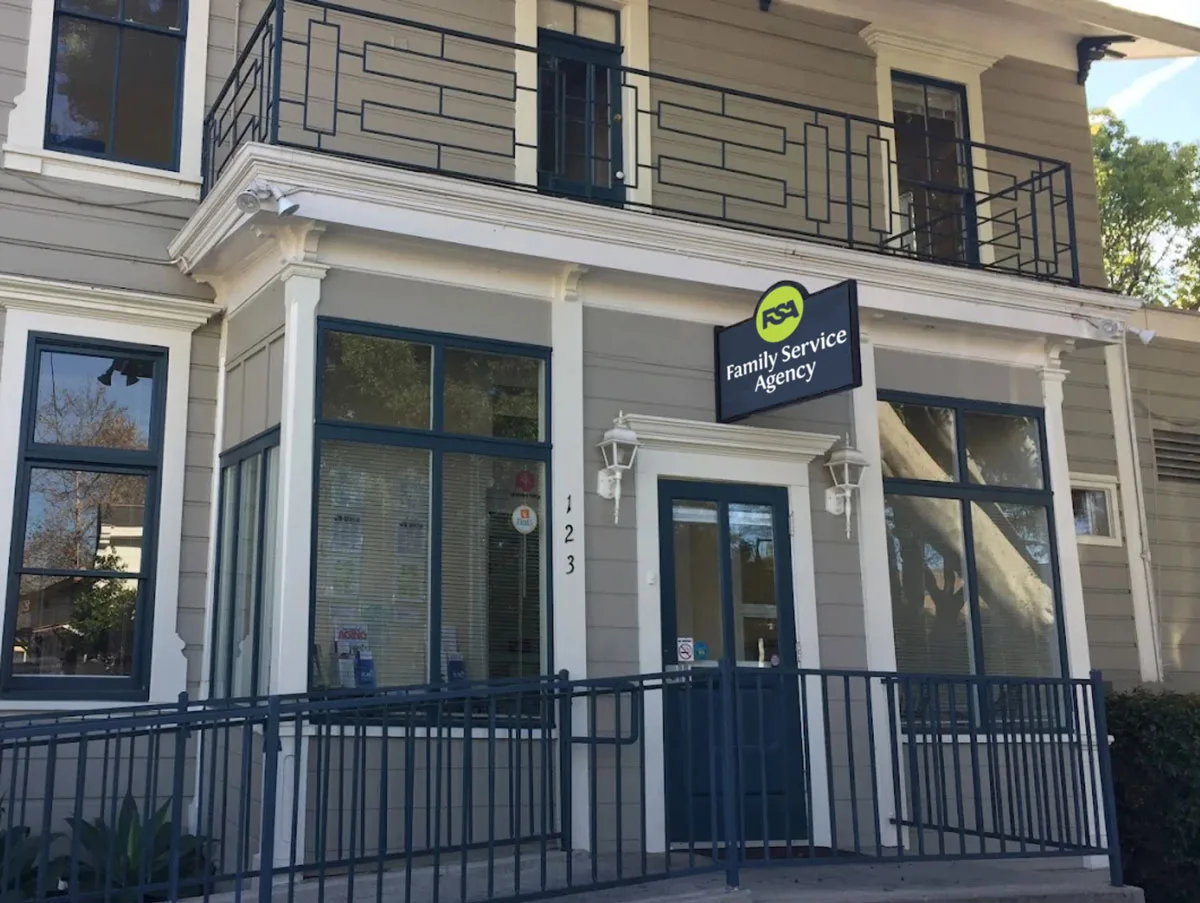
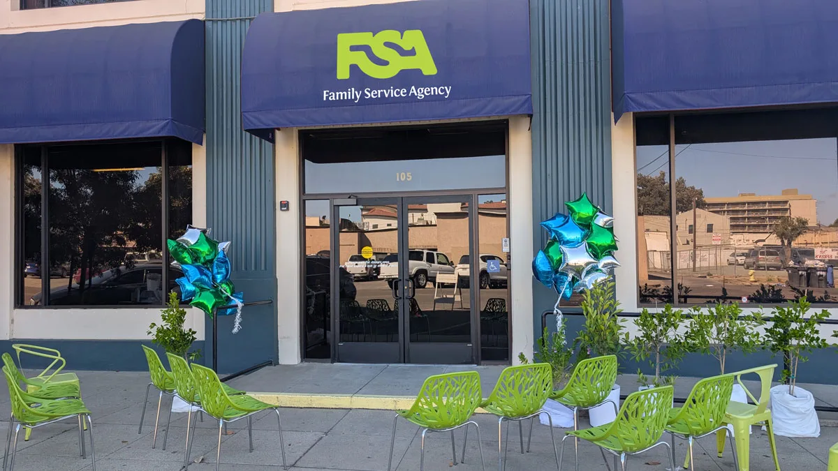
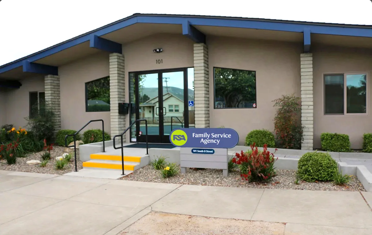
FSA already carried more than a century of trust, but the brand had started to feel fragmented after growth, service expansion, and acquisitions. The new identity helped that trust feel current, connected, and easier for people to enter.
Explore the thinking behind our work.
What Improved
Support became relatable and real.
The brand moved away from labels first and toward pathways people could recognize from their own situation.
History became present-day relevance.
The rebrand preserved 125 years of credibility while making the organization feel current and approachable.
Growth felt more coherent.
The system created a stronger frame for programs, mergers, and future services to live under one brand story.