Cayucos Pharmacy
Elevating a pharmacy through brand identity design and strategically furthering their specialization in the art of pharmaceutical compounding to increase profitability.
The Client
A well known, independent pharmacy that services prescription and compounding orders.
The Challenge
As insurance companies drive down costs, independent Pharmacy suffer. Fortunately, this client has a specialization in pharmaceutical compounding. The challenge is the awareness and education of the compounding service that benefits the patient as well as the pharmacy.
The trust was already there. The brand needed to make the specialization easier to see.
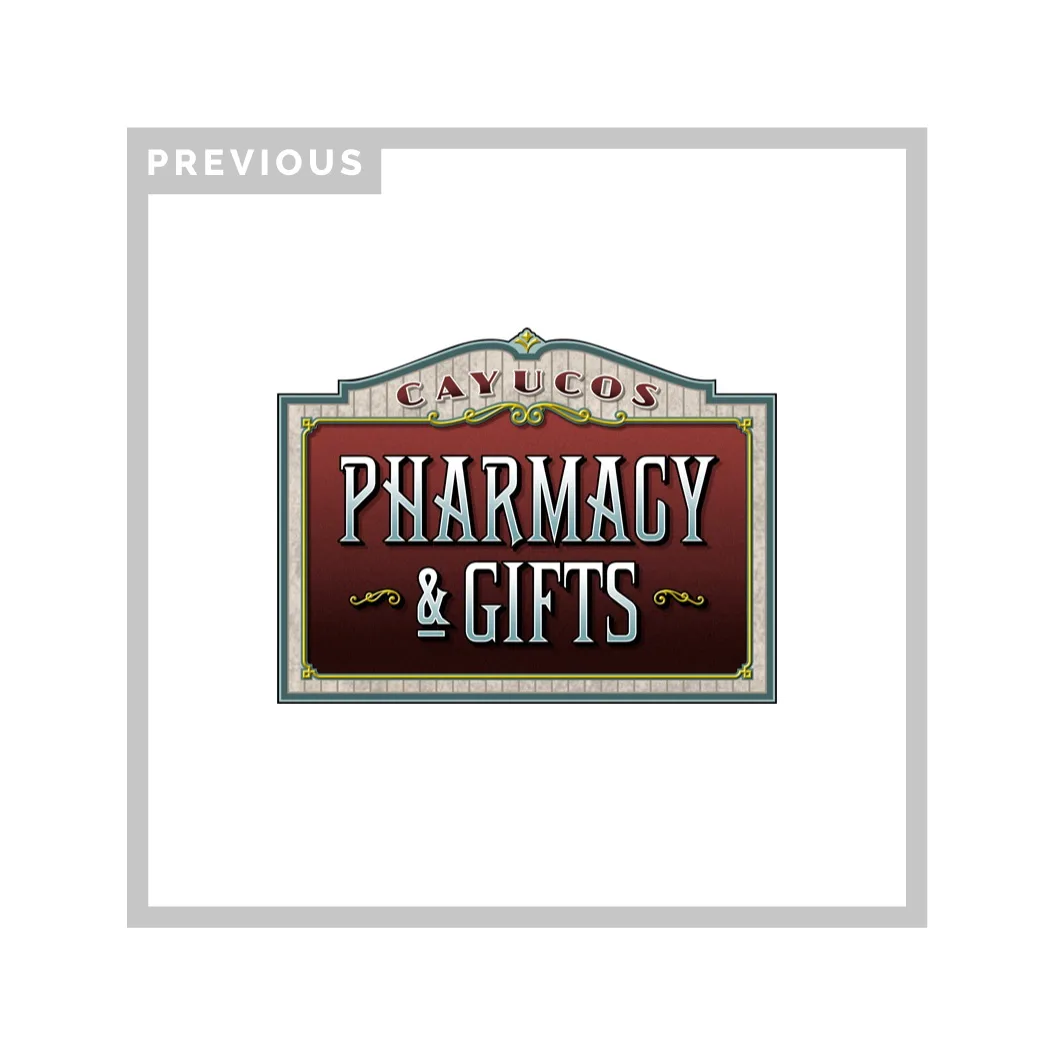
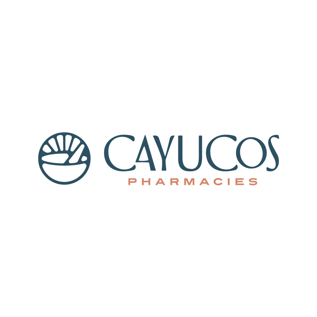
Cayucos Pharmacy had local recognition, but the brand needed to carry more than familiarity. The rebrand made compounding, care, and trust easier to recognize without losing the neighborhood equity the business had already earned.
The Strategy
By leaning further into the expertise of compounding, we can help the pharmacy not only stand out from the big box competition, but also increase profitability through the superior compounding product that is better for the patient.
The Design
Juxtaposing the big box Pharmacy, the design would be best to focus on the traditional roots of the pharmacist craft. The design will need to be trustworthy, professional, yet not clinical or cold.
The Creative Solution*
Based on the true expert craft of a pharmacist, we let the brand's identity focus on the iconic mortar and pestle. This emphasized the care, precision, and handmade art of traditional compounding while supporting the new strategic focus for the business. The icon is geometric and mathematical, while the wordmark carries a coastal character that helps the pharmacy feel independent, specialized, and rooted in its region.
The Results
The business name and brand are now prepared for future scalability and DTC sales, while the business has benefited from a drastic increase in compounding fulfillment and brand recognition.
This brand identity received award-winning global recognition as it was one of 3000 brand marks chosen out of 39,000+ submissions from 60 countries to be published in the thirteenth edition of the popular LogoLounge book. It also received a 2023 Winner Award from Graphic Design USA Magazine (one of the most prominent industry publications since 1963), an Award of Excellence in the 2023 Best of Brands Award (an annual international logo competition).
The Shift
The rebrand shifted attention from neighborhood familiarity to compounding expertise, making the pharmacy's higher-value service easier to understand and choose.
Explore the thinking behind our work.
What improved
Compounding became the focus.
The brand shifted attention toward the pharmacy's higher-value specialization and patient benefit.
Craft felt professional.
The identity balanced traditional pharmacist care with precision, independence, and credibility.
The offer became easier to expand.
The name and system prepared the business for compounding growth, recognition, and future DTC sales.
The identity earned global proof.
Award recognition helped validate the transformation for a specialized independent pharmacy.