Thirsty Sunshine
Bringing the sun to a one of a kind skin and suncare line through a nostalgic California brand.
The Client
A very unique patented product that is disrupting the sunscreen and beauty industries.
The Challenge
Introducing a new brand to an established market where it must not only stand out, but educate while being relevant.
The Strategy
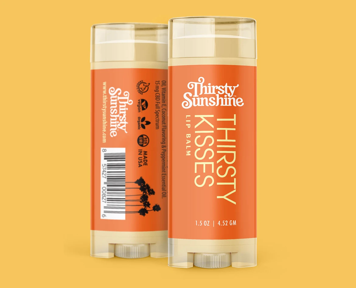
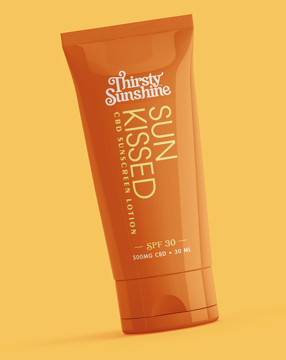
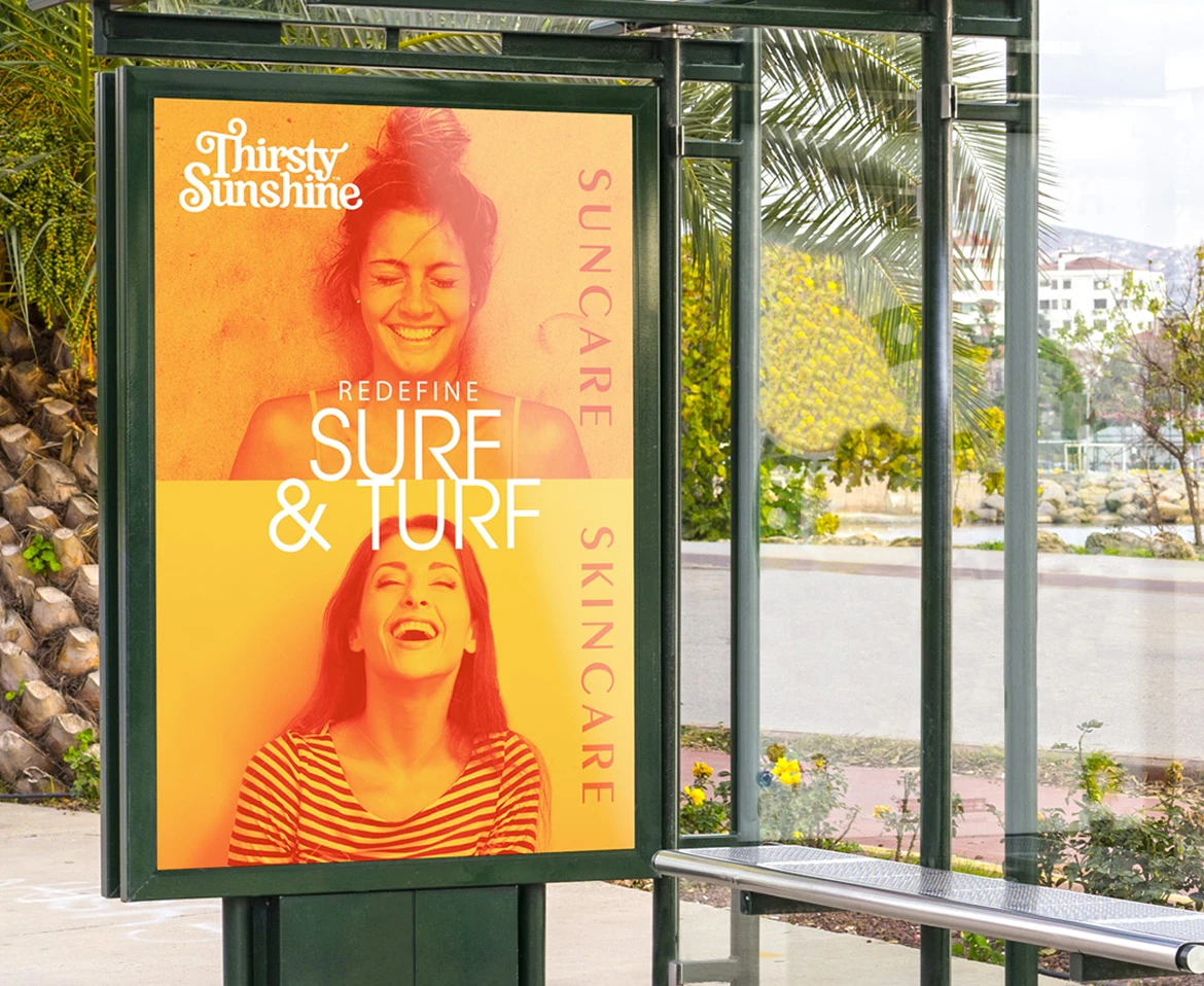
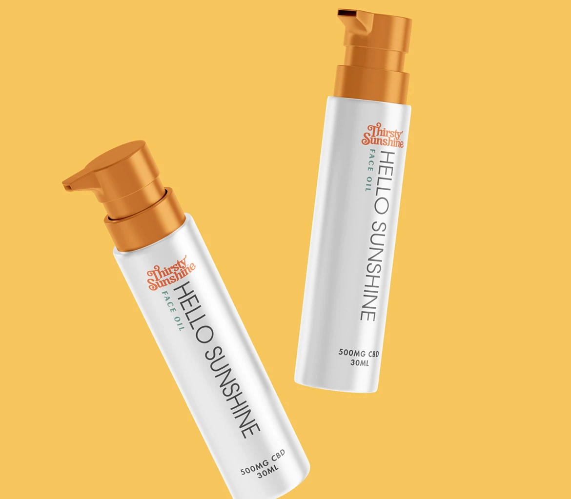
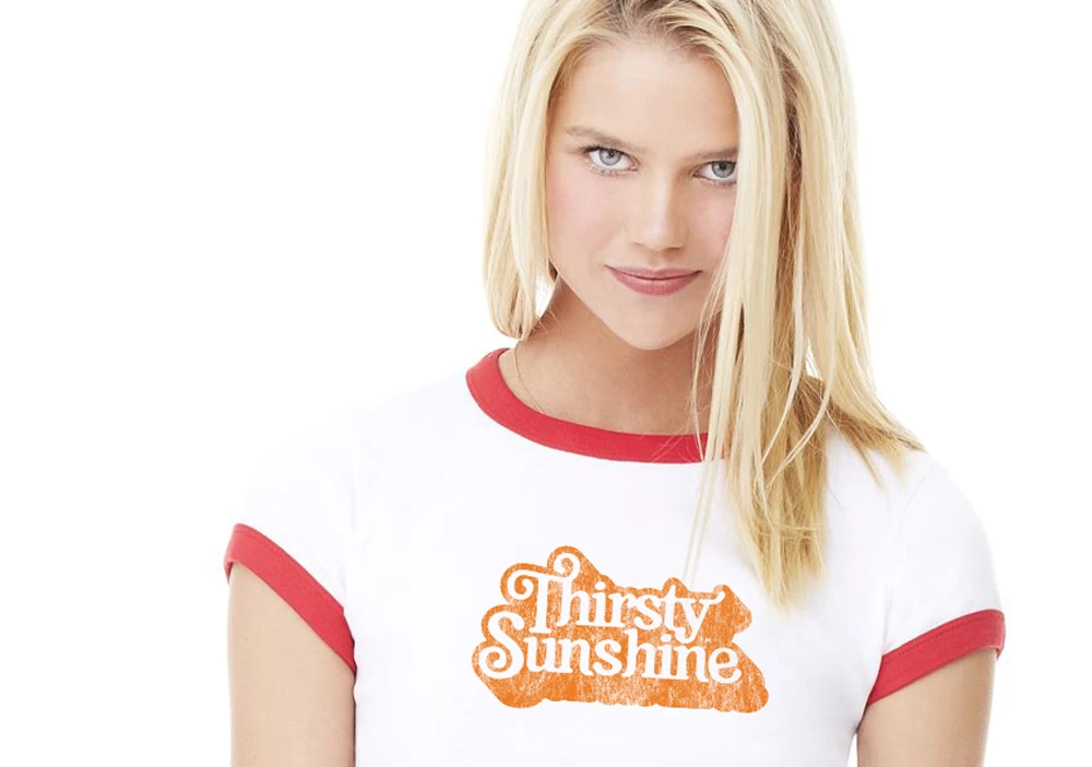
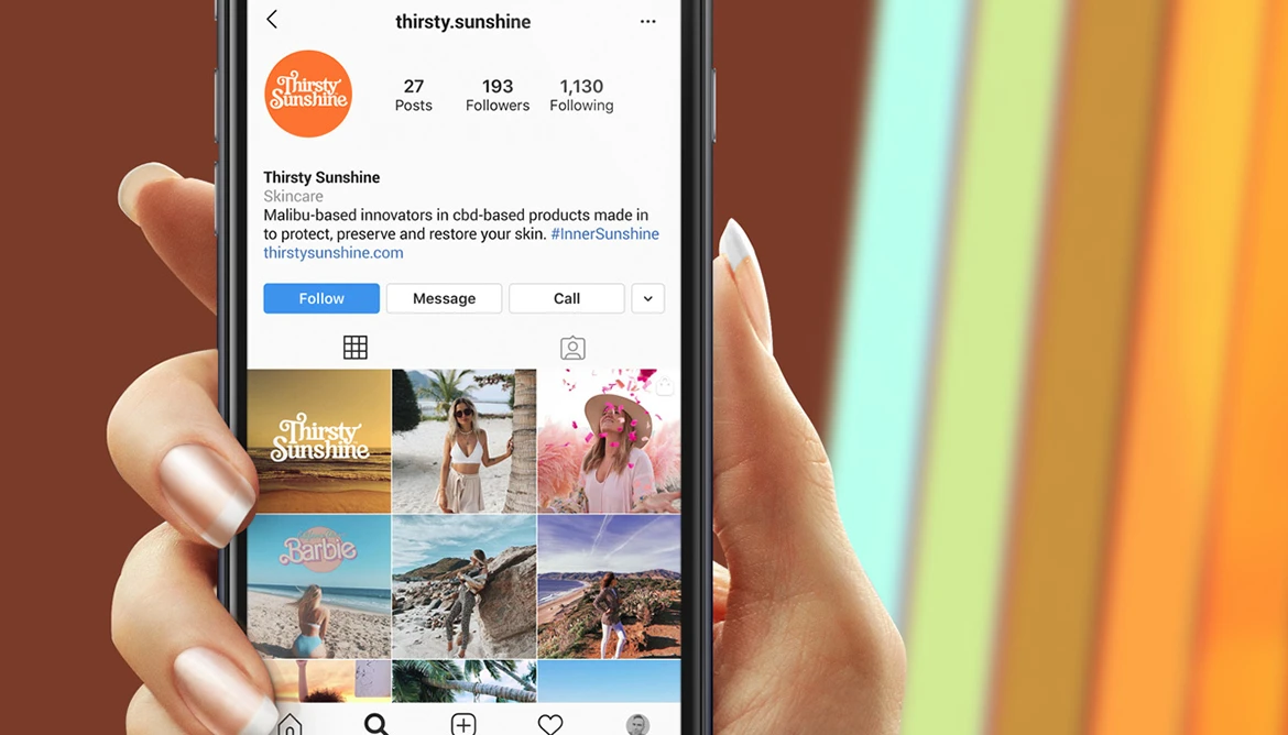
The brand strategy created to introduce this one of a kind product was to develop a familiarity with the consumer through the use of nostalgia. By having an aesthetic that is rooted in the 70’s era while still having an essence of relevant youthfulness, we positioned the brand to be approachable yet still have a high-end cosmetic quality.
The Design
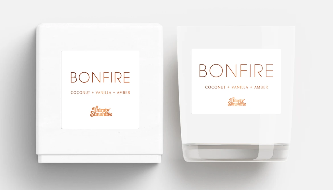
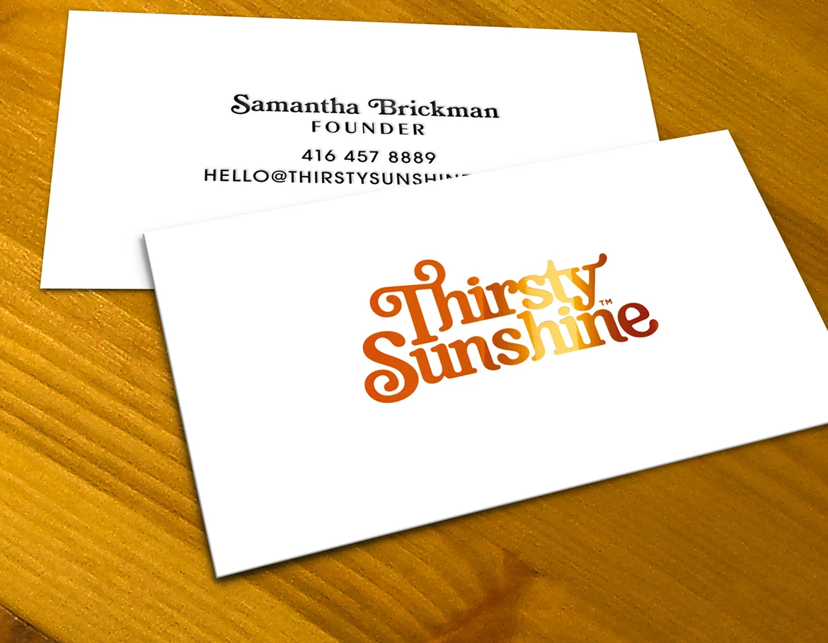
The brand’s identity from logo to packaging is an upbeat, happy vibe inspired by the 70’s. The design on all fronts is balancing a clean and minimalistic aesthetic that with the funky design of the timeless 70’s, by doing so the design is always in a state of juxtaposition and creates intrigue for the viewer.
The Creative Solution*
The balance of familiarity helps the brand be viewed as an already accepted option increasing the market adoption of this new product and brand.
The Results
– Samantha B., Founder
*Learn more why our solutions drive results.

