SLODOCO
The Central Coast's favorite donut shop wanted to expand their locations and grow their audience.
The Client
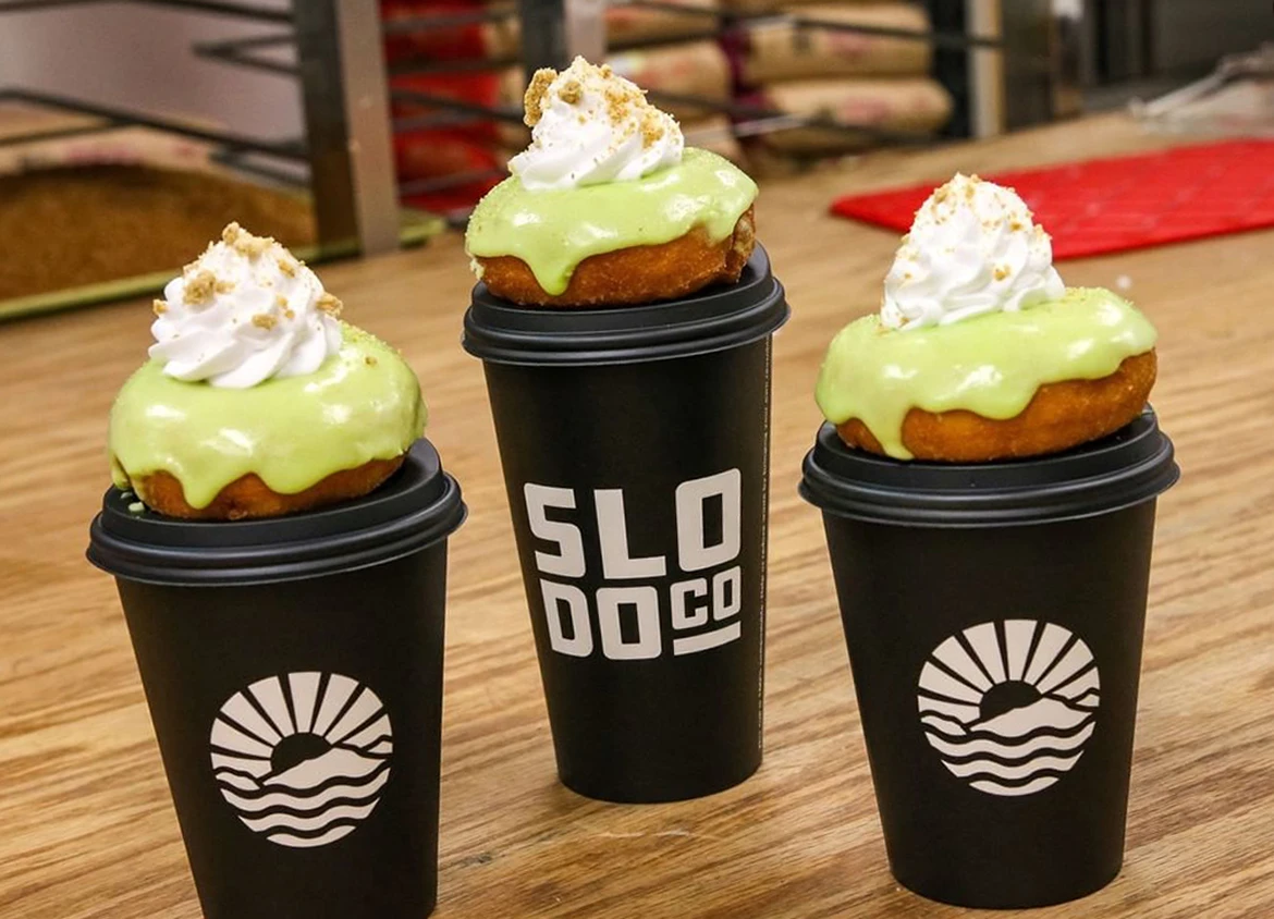
As seen on BuzzFeed and Insider, San Luis Obispo’s SLODOCO is one of the most beloved brands among Cal Poly students and Central Coast dwellers alike. Formerly known as San Luis Obispo Donut Company, the brand has evolved to just “SLODOCO” thanks to the contemporary catalysts of their strong following.
The Challenge
Create a brand that connects with the cult following of our client and rallies them closer together while reaching new customers as they expand to more locations.


The Strategy
The existing brand held a lot of value and we needed to refine and redirect those energies into a stronger brand identity that will “catch” all of the attention and press they regularly receive. The strategy here was to develop a brand that was scalable, yet also rallied together the tribe they have built over time. We wanted a pride with the brand that current fans can share with new fans. With this in mind, we also wanted the brand to be able to naturally evolve and allow its audience lifestyle to evolve with them. The brand identity and logo design needed to not only be contemporary, but also unique and founded in their local history.
The Design
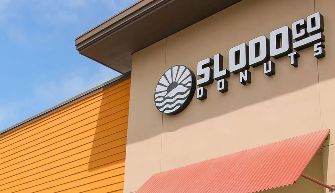
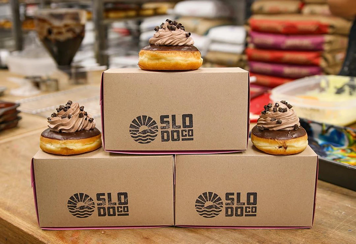
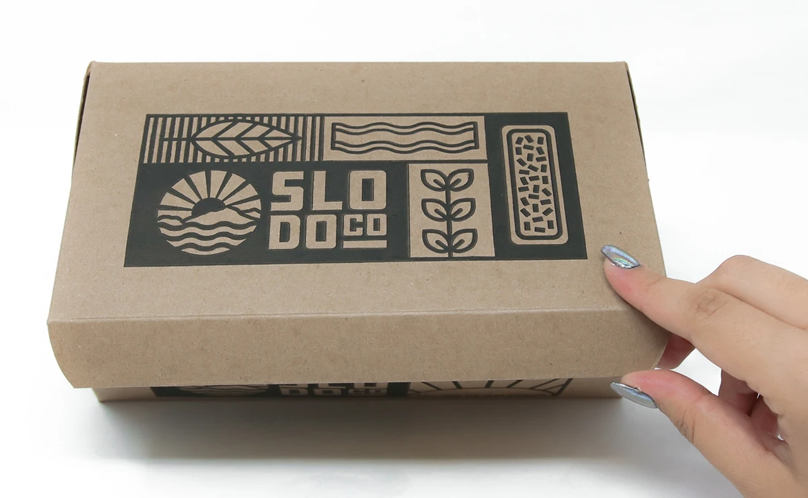
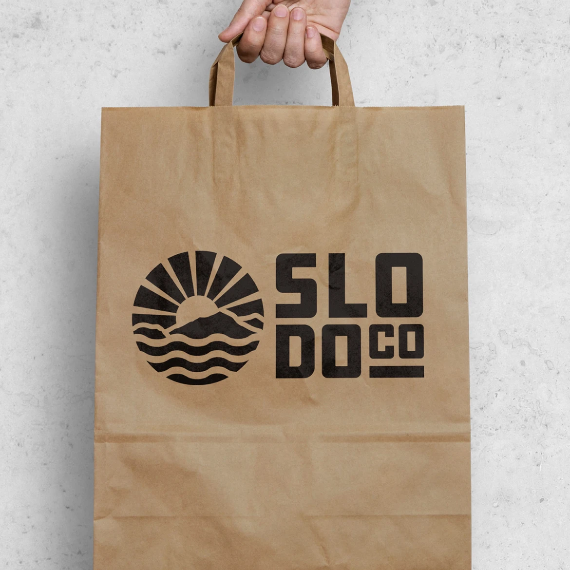
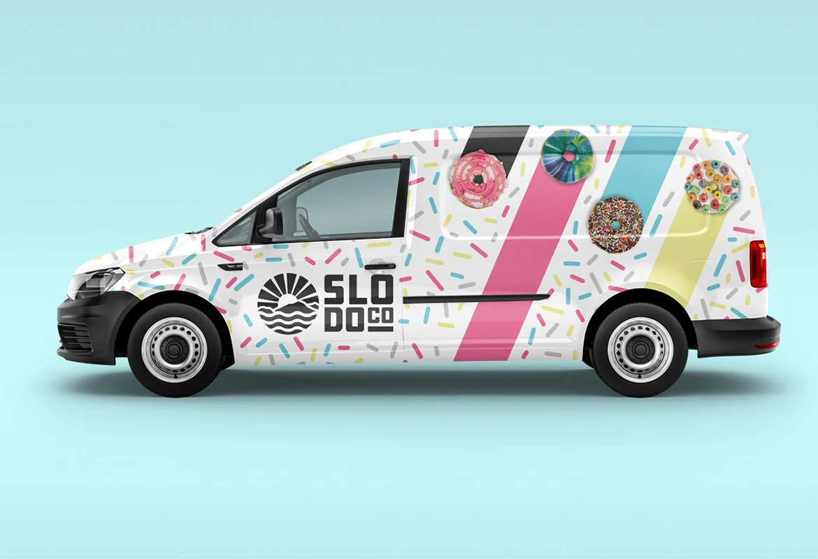
This brand identity evolved to aesthetically best portray this famous donut shop as not only the business that it is, but the lifestyle that they envelope and cultivate. The design needed to be scalable and relatable. We also wanted our client to not be just known for incredible donuts, but become fully integrated with the lifestyle of their following. This design became a mark, an icon that can breed more depth to the brand and be more than just donuts. This allowed the brand to grow in an extremely healthy manner that granted the business the ability to become more dynamic in services, offerings, products, etc. The design signals lifestyle elements that represent the local San Luis Obispo region and integrates a hidden “donut” with the rising sun to help the history of the brand to never be forgotten as they continue to grow.
The Creative Solution*
A brand that speaks to the bold personality of SLODOCO and provides a “beacon” for their tribe to support and feel a belonging to even as they expand into new locations or add more offerings.
The Results
Growth of the brand by 500% through birthing new locations through the Central Coast plus increased revenue streams through merchdise sales.
– -Brandon M., Business Manager

