Double Dose
Brand and packaging creation for a handcrafted Bloody Mary mix.
The Client
An entrepreneur who decided to make the leap of taking his product to market with a proper brand.
The Challenge
As a new product to hit the shelves, this brand needed to not only find its proper place in the market, but also standout in a way that represents the product as well as its local California origins.
The Strategy
After researching the Bloody Mary segment of the alcohol industry, there were existing products, but they all had similarities to one another. This allowed us to explore a new aesthetic that would help the brand standout in its own position within the market.
The Design
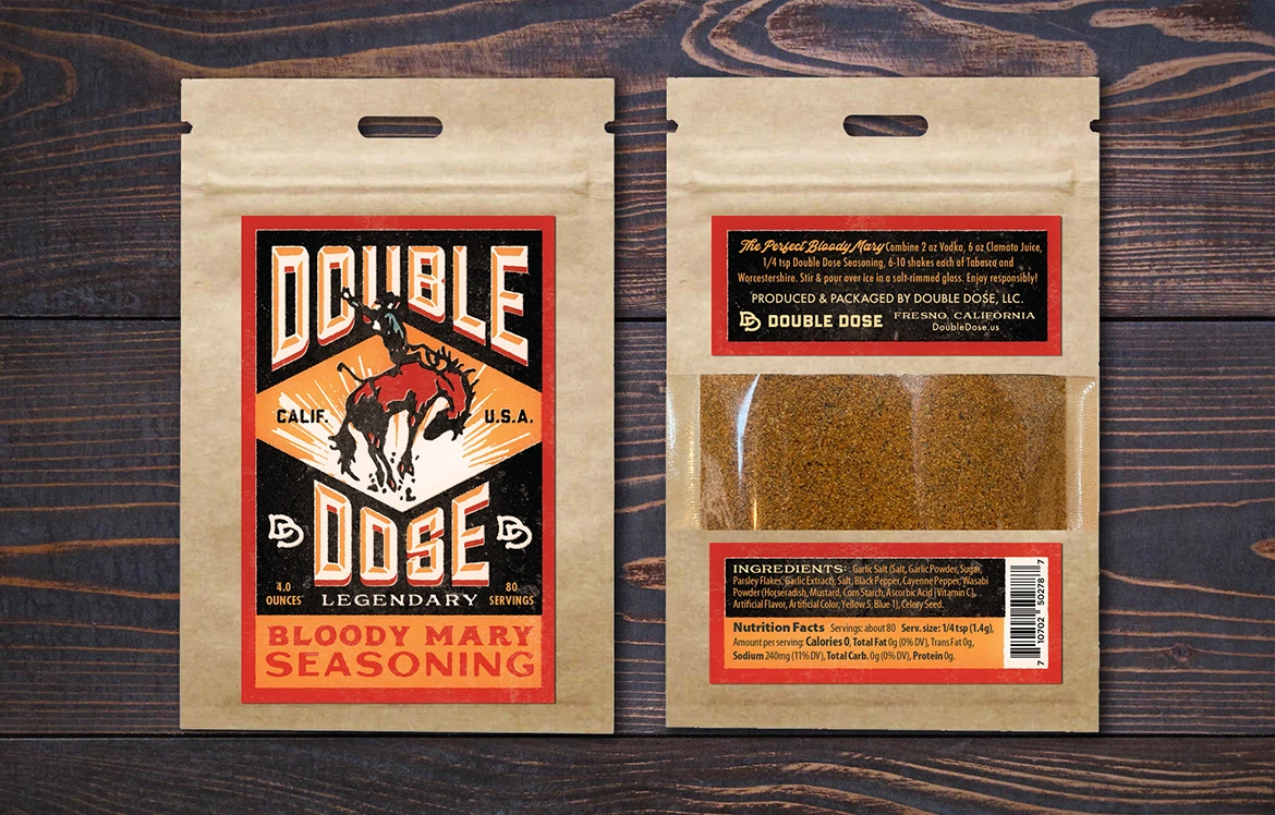
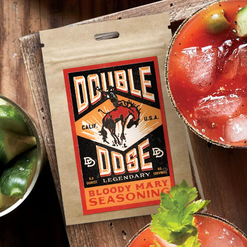
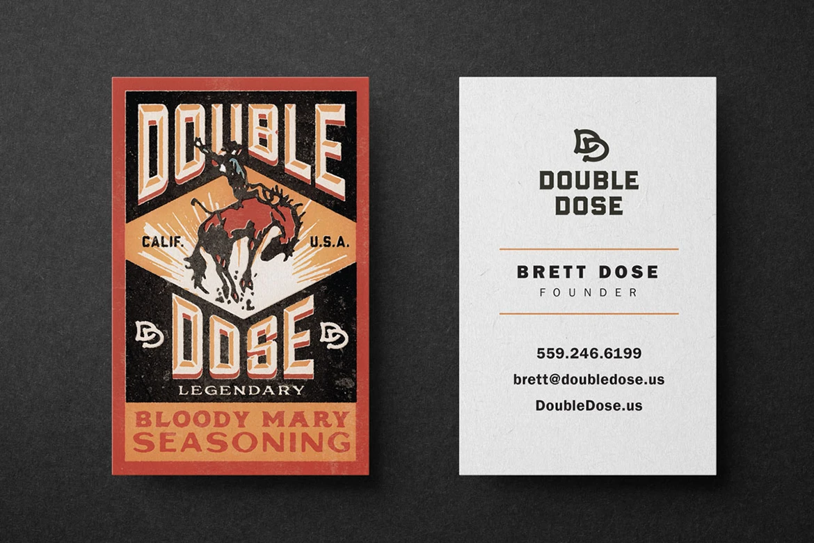
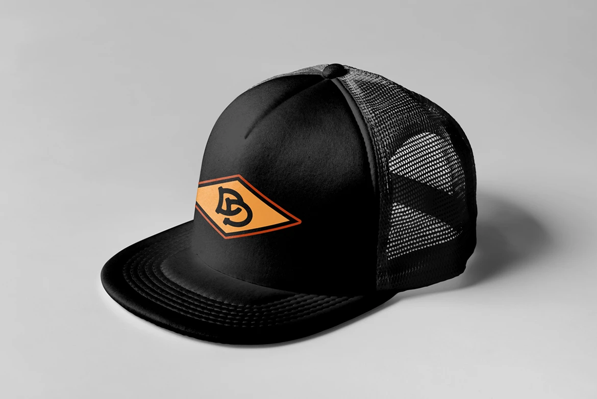
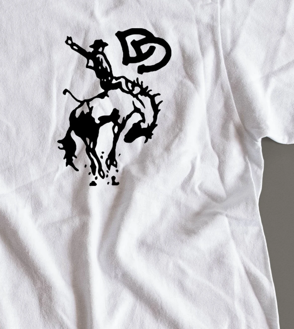
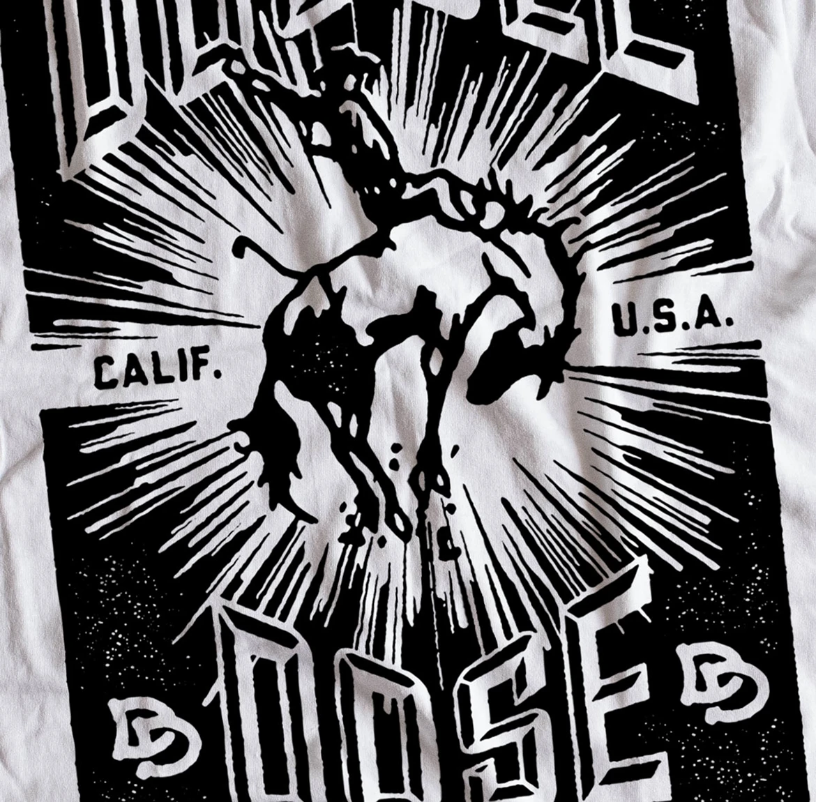
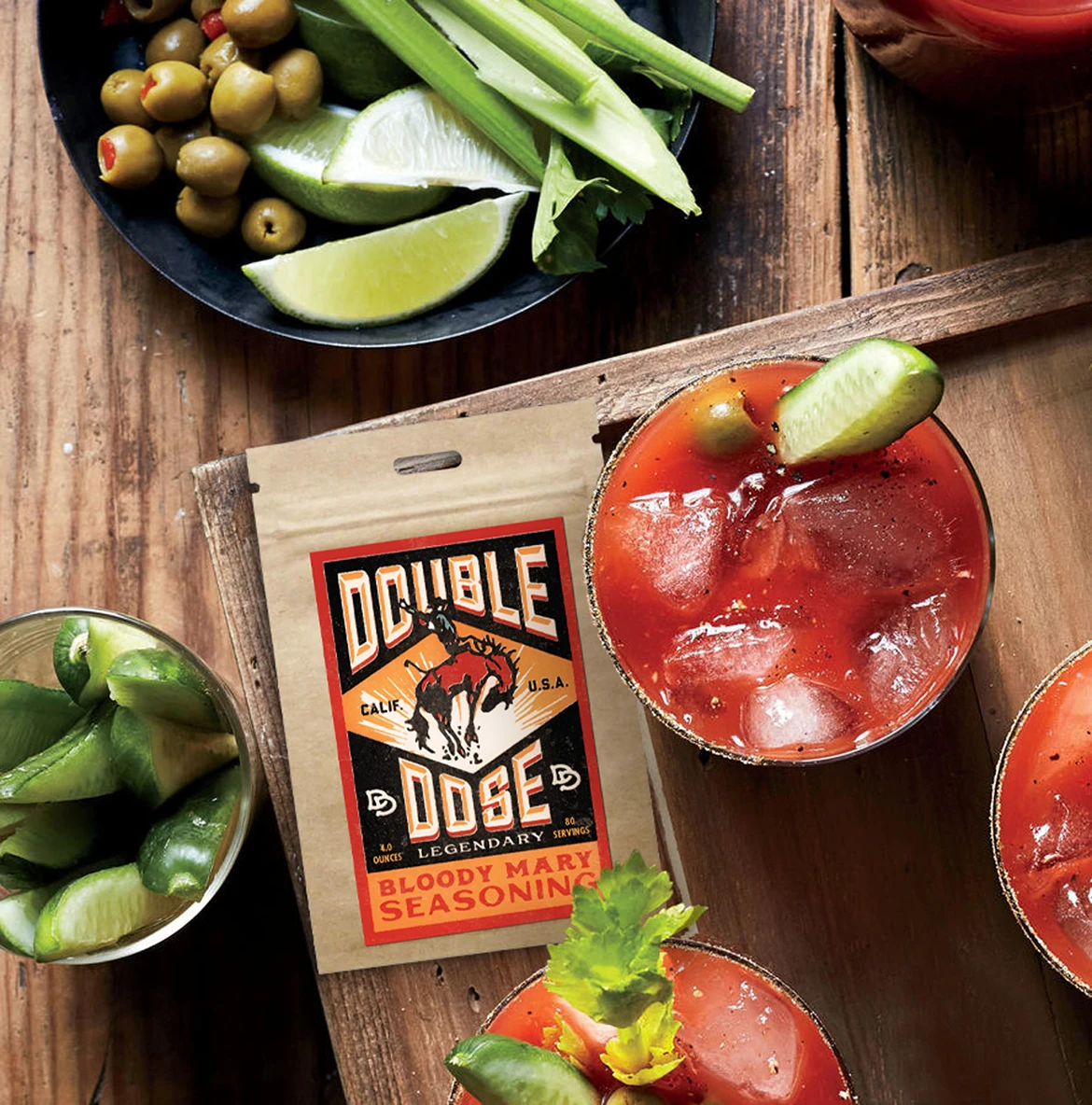
The design for the brand focuses on its main instance; the packaging. This allowed the brand to use elements from the label design and incorporate these attributes into its visual identity as a whole. The design is nostalgic in nature with a slight nod to the Wild West which hints at the Southwestern influence in the spice of the product.
The Creative Solution*
The timeless brand stands out from its current market and sets a tone that is both intriguing and memorable. The solution allows the brand to be able to expand as well as dominate its place in the market based on its visual identity and unique flavor profile. View the website
The Results
The brand connects with the specific audience and gives them a perfect solution for their Bloody Mary cravings by offering a specialty mixture. Creating the association of the brand’s imagery with the product’s flavor profile drives the emotional connection of the brand to their favorite drink.
– Brett Dose, Founder, Double Dose Seasoning
*Learn more why our solutions drive results.
